A complete brand identity.
This is Ontivum's own identity, shown the way a client would receive one: the logo, the system around it, and the files to use it the same way on the web, in print and on a phone.
The mark
A name with one sharp turn.
The wordmark is drawn letter by letter, not typed. A square symbol carries the same idea where the name won't fit.
01Primary wordmark
02Symbol

03The idea
Sharp to smooth.
In one stroke the v turns sharp and the u turns smooth: tangled work, made simple.
04Lockups

05Color
Ink
- #101010
- RGB 16 16 16
- CMYK 0 0 0 100
Paper
- #F5F4F0
- RGB 245 244 240
- Warm white stock
In use
The same brand on paper, on screen and in a browser tab.
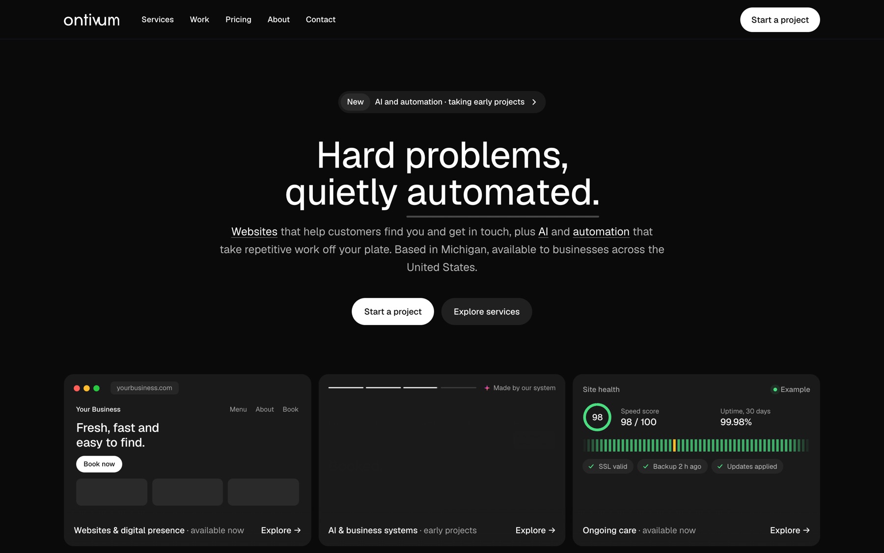
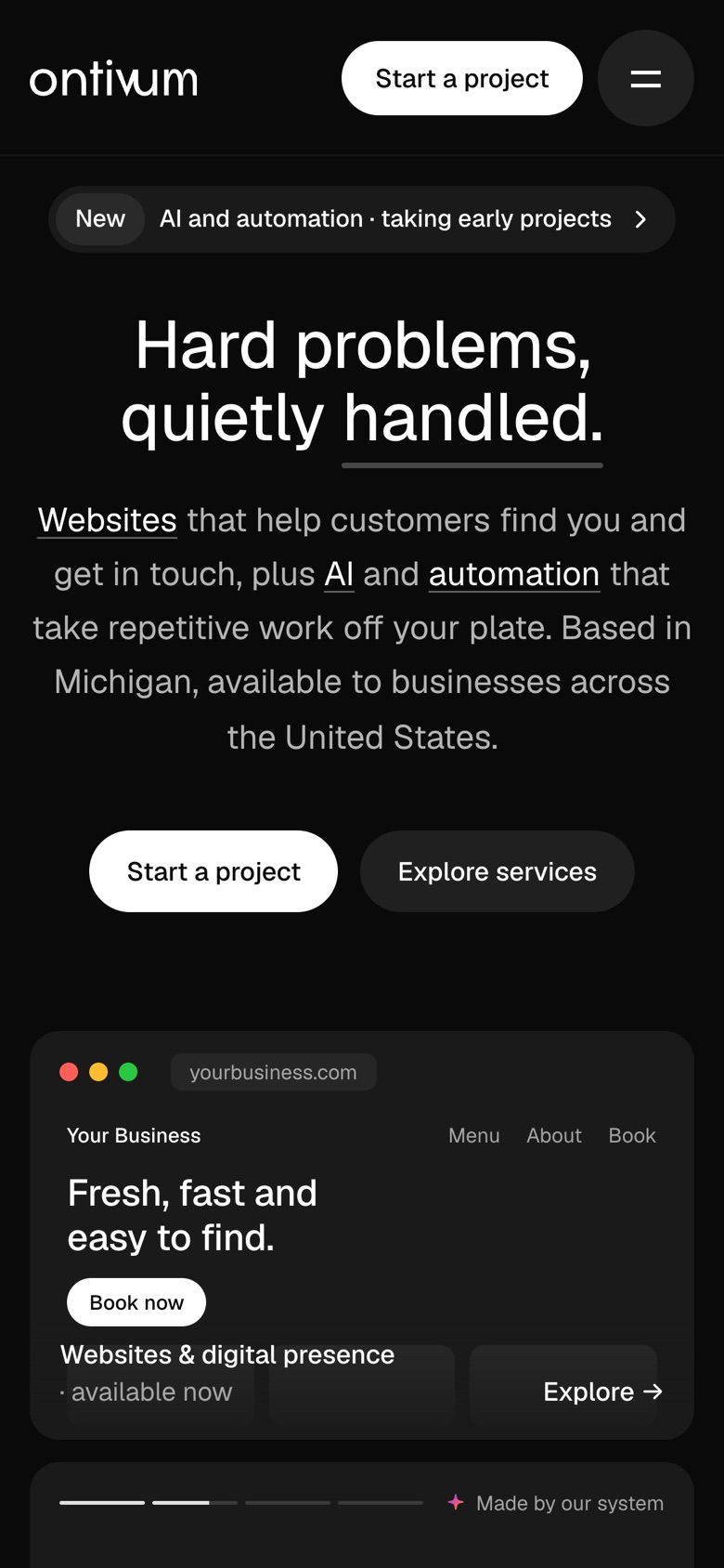
Everything here is the real thing: the cards are rendered from the print files, and the screens are ontivum.com.

06Business cards
07Website
08Icons
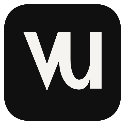


09Typography
10Guidelines
Clear space 1 × x-heightMin 88 px · 22 mm
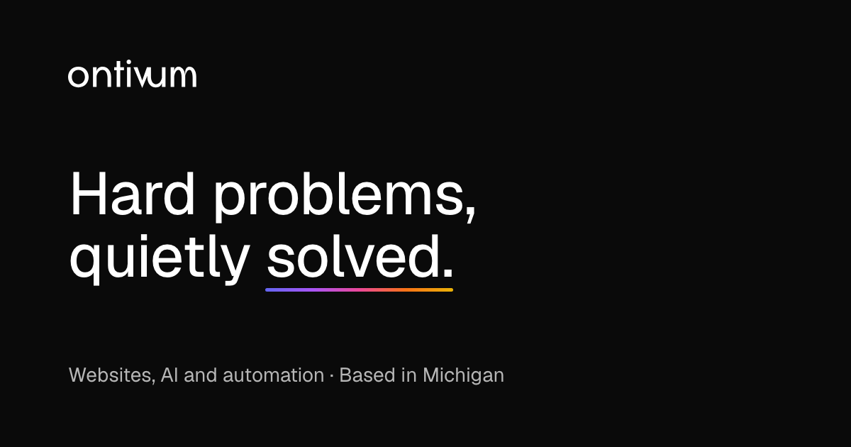
11Share image
In motion
The brand, moving.
A 12-second loop made from this site's own pieces: the code window, the messages and the site health card. It plays without sound and repeats with no visible seam.
12Motion loop
What you get
Everything your brand needs to look the same everywhere.
Files that are yours once the project is paid, ready for your printer, your web developer and your social profiles.
Taking early projects
- Logo: wordmark, symbol and lockups
- Light, dark and one-color files, SVG and PNG
- Color and type system
- One-page brand guidelines
- Favicon and app icon set
- Print-ready business cards
- Social share image
- Website visual direction